Responsive Website Design and Development
Responsive Website Design & Development
Have you ever seen how your website looks other than your computer? Everyone involved in hand held gadgets, smart phones , pads and intelligent phones and devices. Checkout how your website looks like in a Desktop , Laptop, Cell Phones , Smart Phones , Tablets I pads and Mobile browser and different type of web browsers. We will design you the best single website which will be compatible in every devices and gadgets.
Mobile Friendly Update
This is what Google Webmaster central has officially announced:
“Starting April 21, 2015 we will be expanding our use of mobile-friendliness as a ranking signal. This change will affect mobile searches in all languages worldwide and will have a significant impact in our search results. ”
First let us make you understand and clear about the “responsive” thing.
Features of Mobile Friendly Website
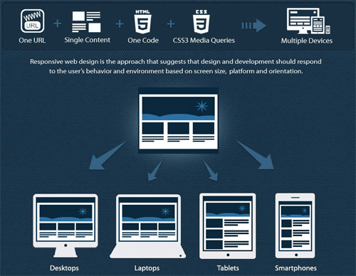
Responsive web design is the approach that suggest that design and development should respond to the user’s behavior and environment based on the screen size, platform and orientation. On The base of the following features we can analyze and create a good responsive web design suitable for every system.
Accessibility
Design the website with a better practice which can be accessed from each n every type of devices. Not only the layout but also the content, images and videos can be viewed easily in the website from any type of devices and gadgets.
Device Detection
Your website must be designed and coded in such a way that it can read and send the data to the mobile as per their specification and types.
Single Website
Your website should be designed for every devices and gadgets , without changing the basic CSS, HTML and content of the main website deigned and developed corporately for your company or business.
Web URL
Making the system search engine friendly , able to use the same URL links is much dependable in Desktop PC, Laptops, Hand held gadgets, I pads, Intelligent Devices, Tablets, Smart phones, Cell Phone and and their relative web browsers used.
Content Optimization
Since you must update your website each and every minute in today’s informative world , you cannot spend lot of time in adding content for every device version, the web must present the same content added in multiple layouts.
HTML 5
The latest version of HTML, used in basic layout coding of the web system and application in responsive version.
CSS 3
Your website must look alike in any form of the device and gadgets . The same css must be used changing the attributes for the multiple screen sets.
Advantages of Responsive Website

Advantages of Responsive Web Design
- Saves Money
- Now you can make your website design look
- Saves Time
- Improved Seo
- Better Performance
- Wider Browser Support
Features To Responsive Web Design

Features of Responsive Web Design
- Features of Responsive Web development
- Flexible Grid
- Flexible Images
- CSS Media Queries & Screen Resolutions
Make your Website Mobile-friendly
So Don’t Hesitate to make your Website Responsive and Friendly for all Machines, Gadgets and Browsers.
Get free Consulting or Quote
Call: 977 980 10 111 85
